CSS has always been the bane of my studies. I have a hard time grasping its concept.
You read the tutorial, you understood what the properties do, but when put into practice, It doesn't work the way you wanted it to.
While I was doing the Responsive Web Design module at Freecodecamp.org, I was introduced to CSS Grid.
And that just made CSS a tad bit manageable for me.
WHAT IS GRID LAYOUT
According to W3schools.com.
The CSS Grid Layout Module offers a grid-based layout system, with rows and columns, making it easier to design web pages without having to use floats and positioning.
What I understood was, the grid layout lets you divide your whole page into several sections where you can insert your elements.
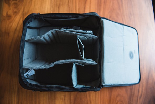
Imagine your page being a suitcase.
With other layouts, it seems that you're packing it willy-nilly.

Things might overlap, cross each other, or maybe even appear where you don't want it to appear.
But by using the grid layout, it may look like a suitcase with a built-in organizer.

There are specific channels that you put elements into. So no more guessing where each element goes to.
How to use CSS Grid
#tile-grid-container{
 min-height: 200px;
 width: 600px;
 background: LightGray;
 display: grid;

}
First, you must set your container dimensions (height and width) and set "display" to "grid".
After that, you can set the number of columns by using the "grid-template-columns" properties.
#tile-grid-container{
 min-height: 200px;
 width: 600px;
 background: LightGray;
 display: grid;
 grid-template-columns: 200px 200px 200px;
 }

the values you input in the "grid-template-columns" would affect the width of the element.
#tile-grid-container{
 min-height: 200px;
 width: 600px;
 background: LightGray;
 display: grid;
 grid-template-columns: 300px 200px 100px;
 }

If you want to use rows instead you can use the "grid-template-rows" property instead. The values you supply in grid-template-rows now affect the height of the elements instead of the width.
#tile-grid-container{
 min-height: 200px;
 width: 600px;
 background: LightGray;
 display: grid;
 grid-template-rows: 300px 200px 100px;
 }

Okay now that you know how to make columns and rows here is where things get a little better
GRID AREAS

In the example above, the bag has different pockets/ sections to hold different things.
By using the grid layout we can accomplish the same effect by using the "grid-template-area" property.
#tile-grid-container{
 min-height: 200px;
 width: 600px;
 background: LightGray;
 display: grid;
 grid-template-columns: 1fr 1fr 1fr;
 grid-template-rows: 1fr 1fr 1fr;
  grid-template-areas:
      "top top top"
      "left right right"
      "bottom bottom bottom";
 }
In the example above I created a 3x3 grid.
which looks something like this.

But that doesn't look great, does it?
So far yes, because we visualize it as a 3x3 grid.
But in reality, it looks something like this.

We can achieve that effect by assigning a div to the area by giving it a property of "grid-area"
/*red color*/
#project1{
  background-color: #FE3C40;
  margin: 10px;
/*set div to top area*/
  grid-area: top;
}

/*blue color*/
#project2{
  background-color: #0EBEFF;
  margin: 10px;
/*set div to bottom area*/
 grid-area:bottom;
}

/* yellow color*/
#project3{
  background-color: #C6A60B;
  margin: 10px;

/*set div to left area*/
  grid-area: left;
}

/*green color*/
#project4{
  min-height: 0px;
  background-color: #63A48B;
  margin: 10px;

/*set div to right area*/
  grid-area: right;
}
And just like that you already have something like a modern site layout.
CONCLUSION
So that's my take with CSS Grid.
If you use it on your own page you can divide your layout into several boxes and use Grid to fulfill your desired effect.
Don't get me wrong, I still get a lot of undesired effects when I play around with CSS Grid.
Mostly are:
- Mis-aligned elements
- uneven spacing at the end of the grid.
And in general, I still have a long way to go when it comes to CSS, and Web Development. 😅😅
Thank you for reading this far!
If you have other ideas on how to use Grid go on and leave a comment down below. If you know a better way to learn CSS and its properties, please share it with us down below 😊😊
Cover by by Kelly Sikkema on Unsplash You can follow me at Twitter
